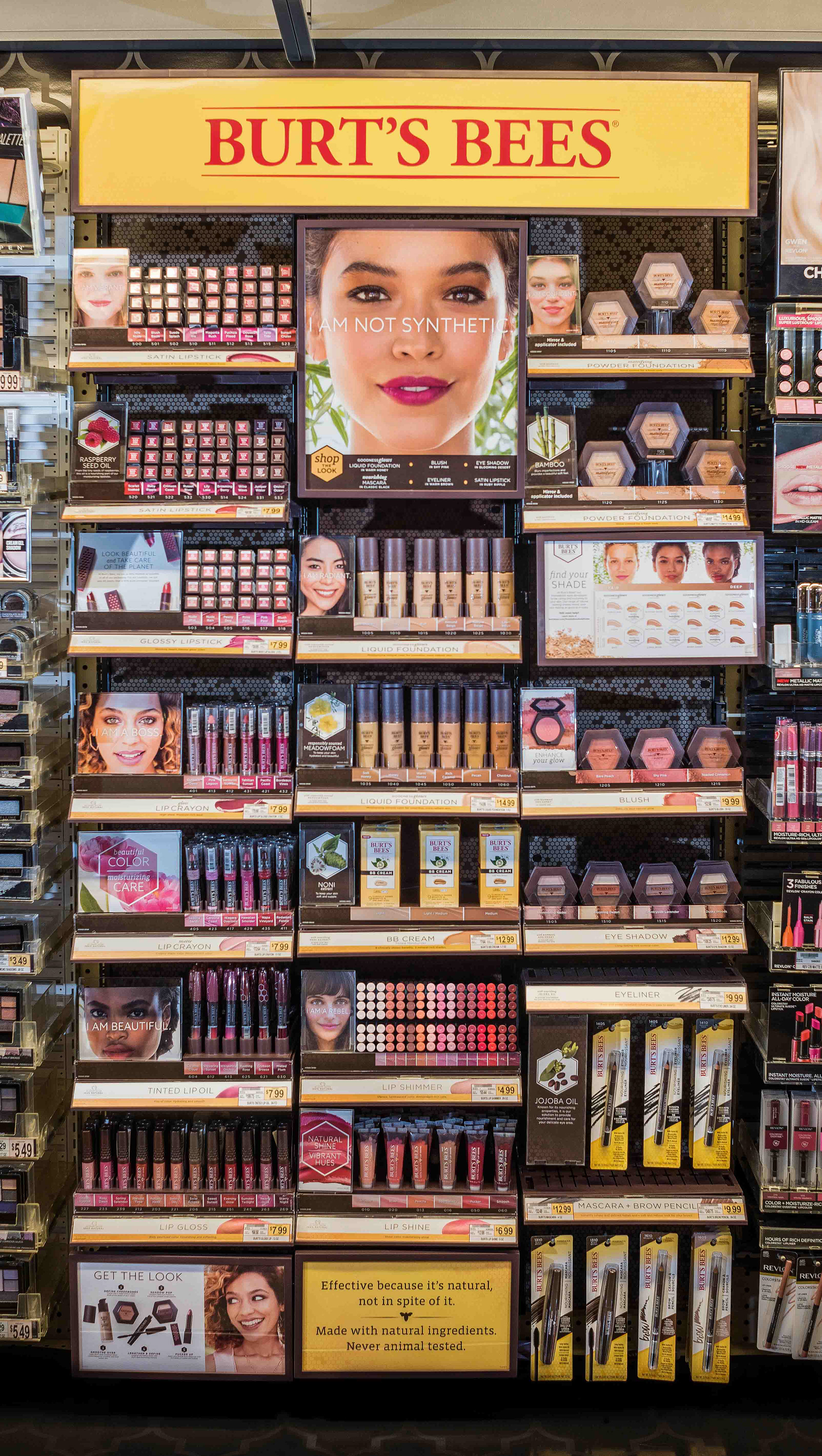
As Burt’s Bees was new to the cosmetics space, we had to design a shelf set that was recognizable as Burt’s Bees, but that also could compete in the mass market. We used hits of yellow on the header and bullnoses to cue back to the equity of brand, while leaning heavily into a dark brown. This helped it feel premium while allowing there to be a backdrop for the consumer to clearly differentiate the shade payoff of each product.