Designing the Structure
With the success of the Burt’s Bees lipstick launch, the brand decided to venture into liquid lipstick. I was tasked with designing the structure as well as the graphics.
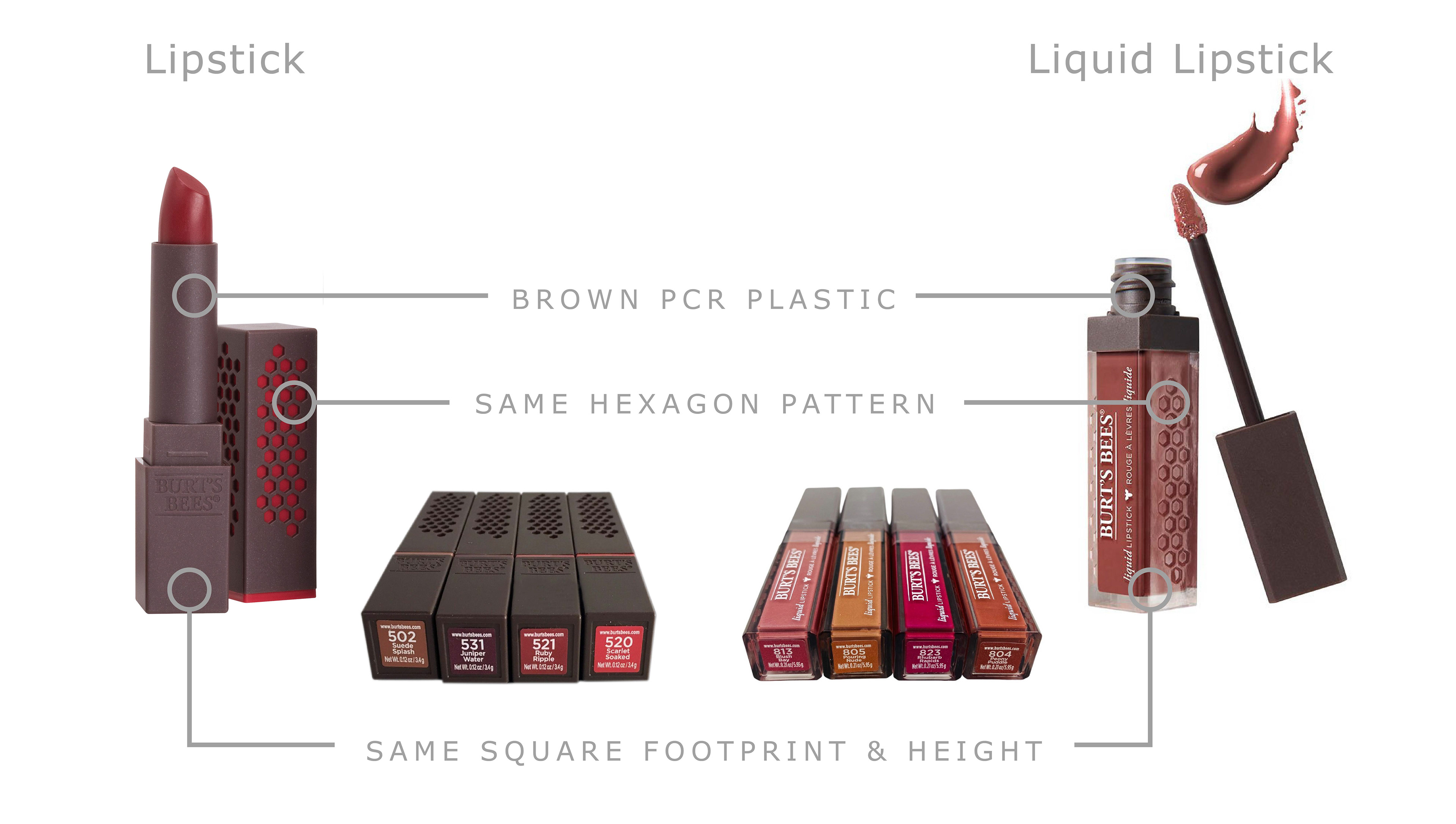
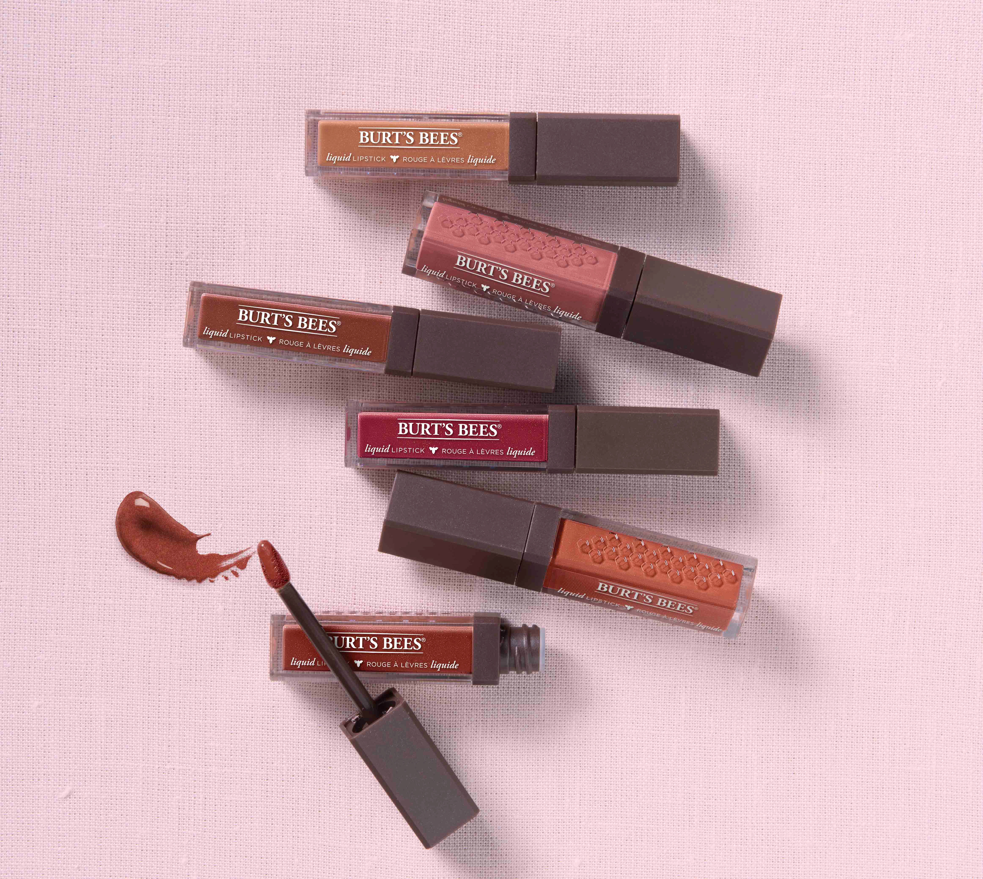
I wanted there to be a connection to the original lipstick so I kept the structure the same size, used the same brown PCR plastic, and leveraged the hexagon pattern. The shade payoff was hard to read on the original lipsticks, so I wanted there consumer to see the actual color through the clear plastic. To have a more elevated feel I used a thicker plastic to mimic a glass base.