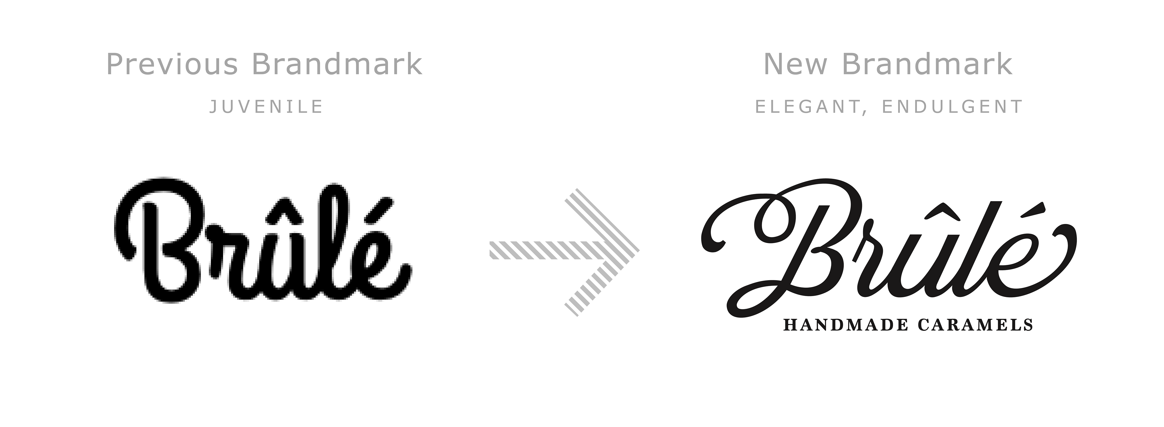
Brûlé Handmade Caramels was in need of a rebranding. They wanted to create an artisan brand mark that is reflective of its French name and felt like you were getting a luxury experience. To do this I drew an elegant "Brûlé" with sweeping flourishes. I kept "Handmade Caramels" in a classic serif typeface to ground the design and keep the focus on "Brûlé".
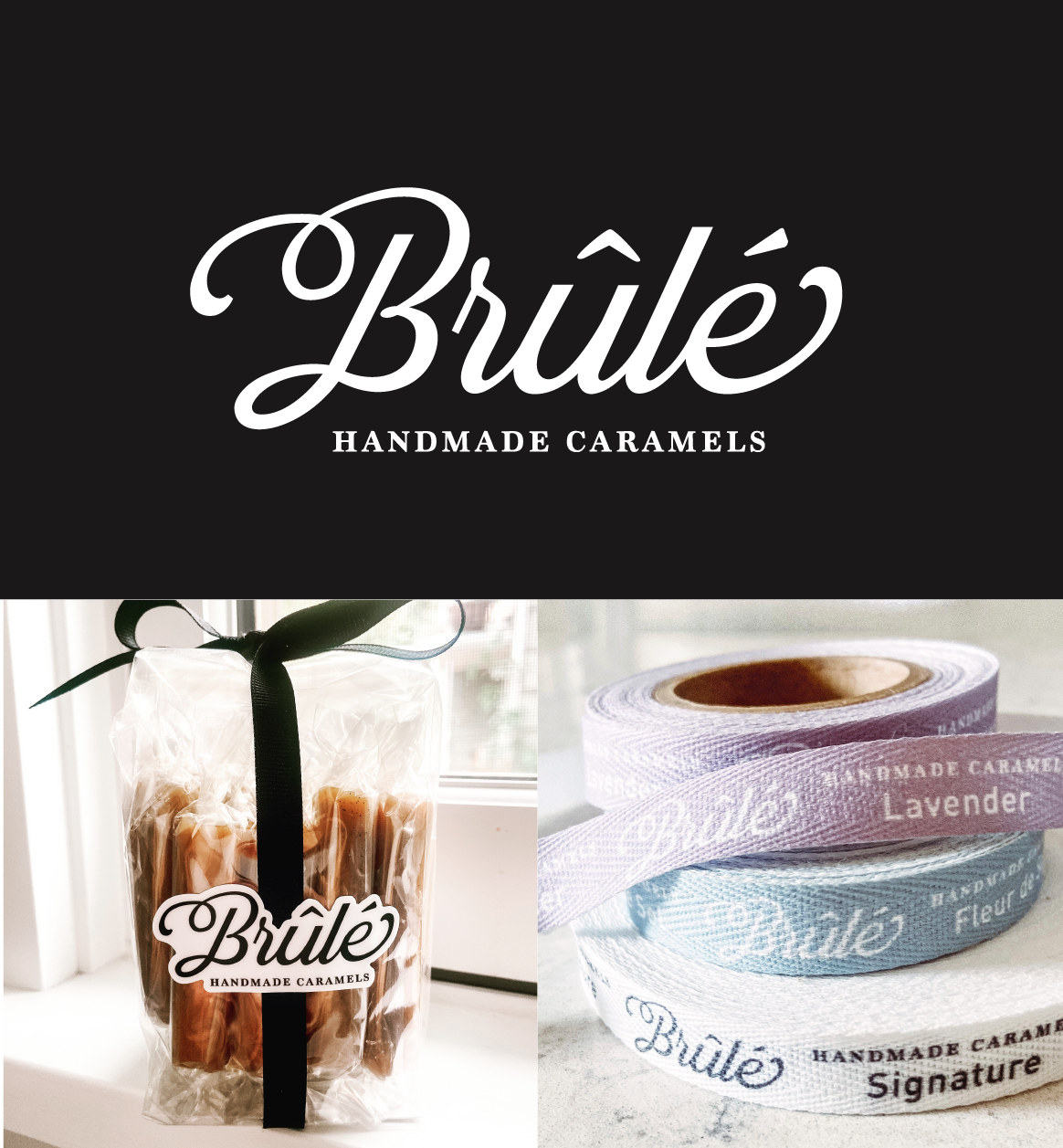
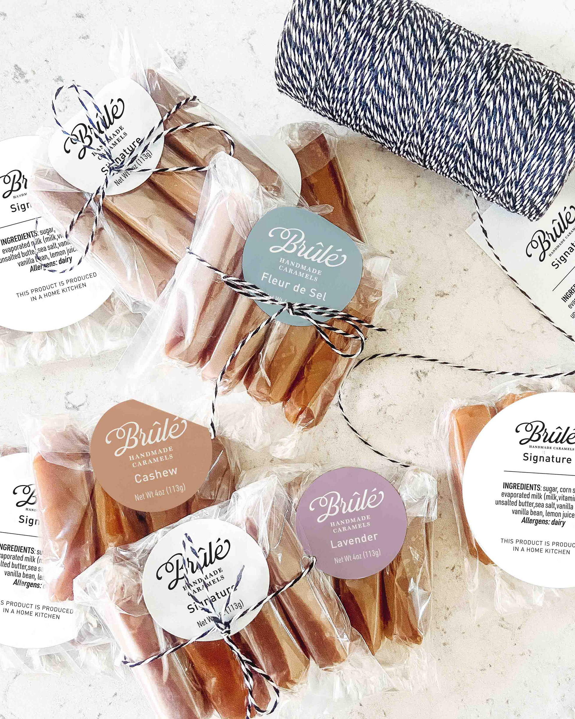
When considering packaging, Brûlé Handmade Caramels needed better flavor differentiation. Their packaging had the flavor listed small, and to the naked eye it appeared that side-by-side they were all the same flavor. We decided to utilize large color blocking to really call out the flavor differences in a fun eye-catching way.