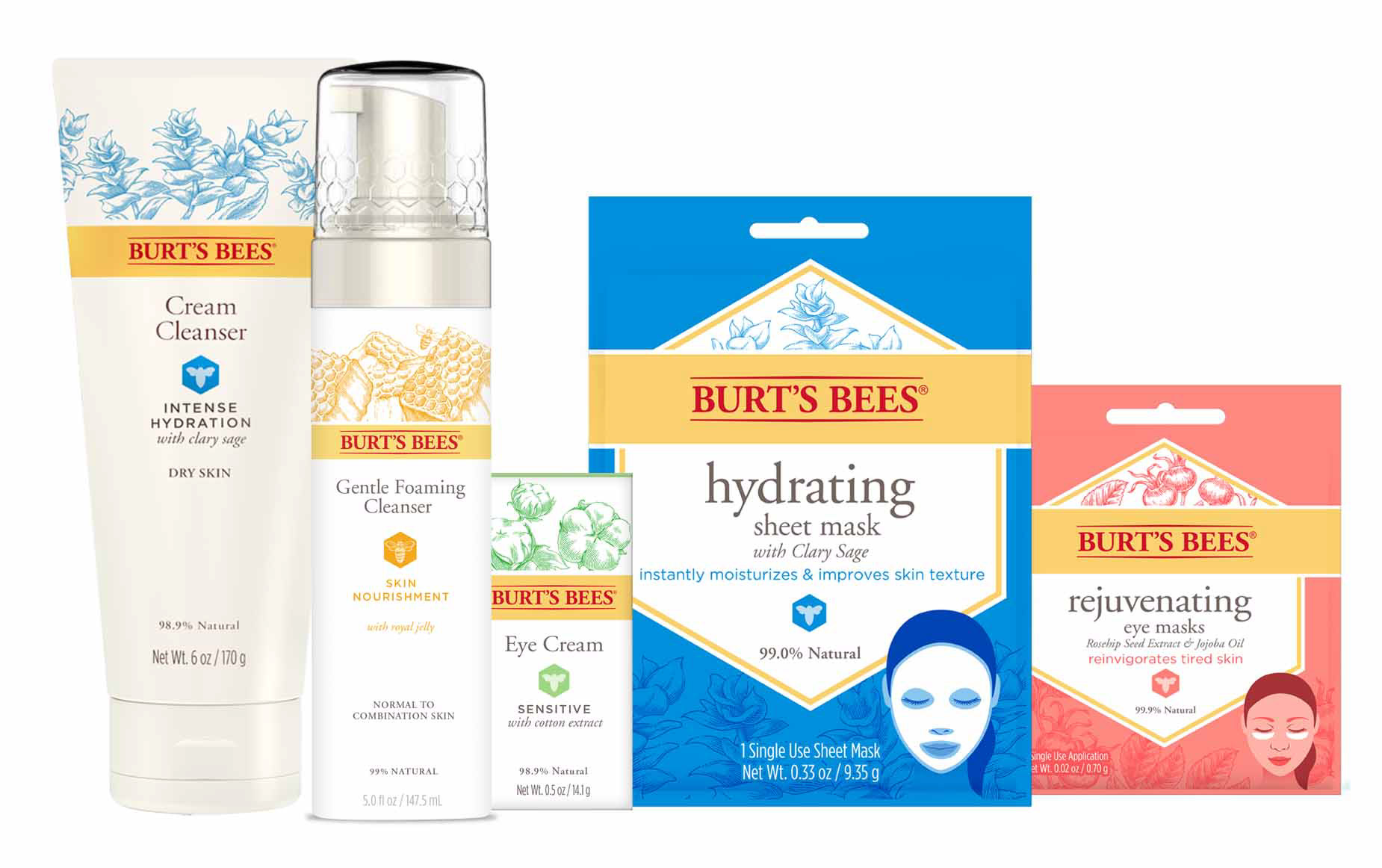
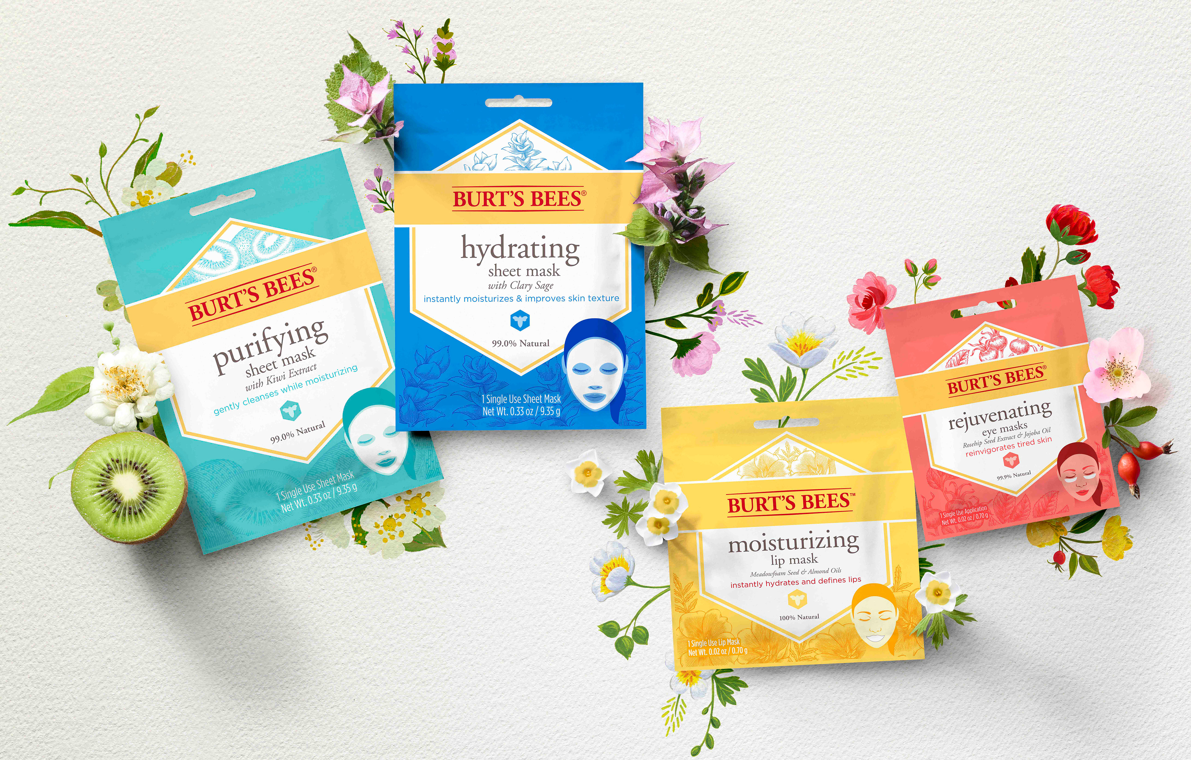
As Burt’s Bees was venturing into sheet masks, it was important for them to align with the current face care regimen and be an impulse purchase item. To do this, I maintained the typography and a presence of white to feel clean and align to our other face care products. I also embraced large hits of bright, youthful colors to help them feel fun.
Fitting in with the Face Care Family