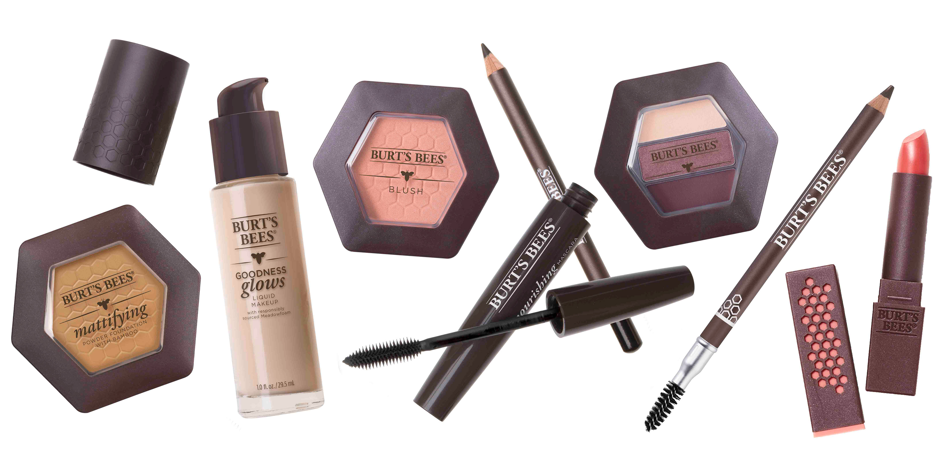
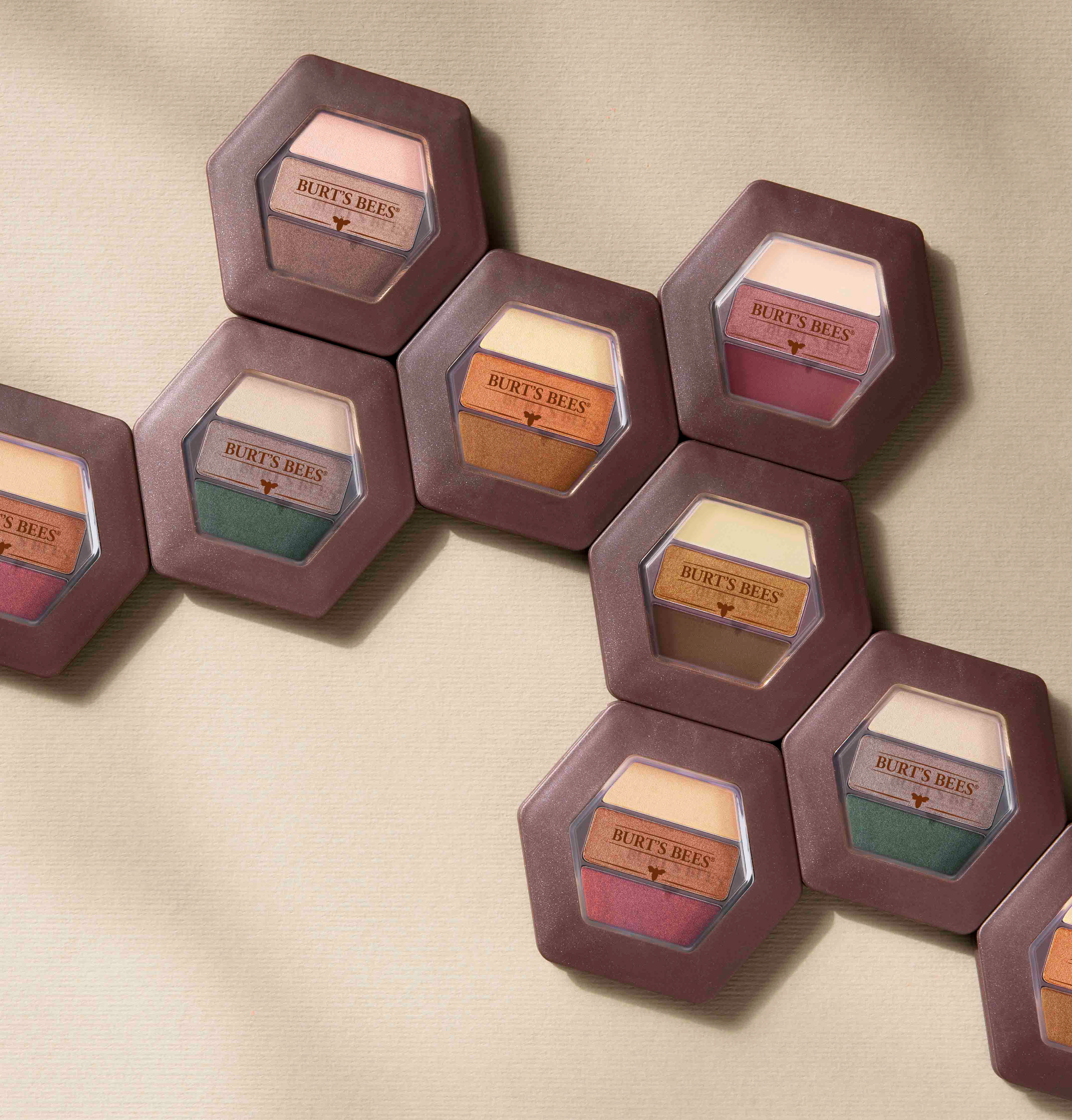
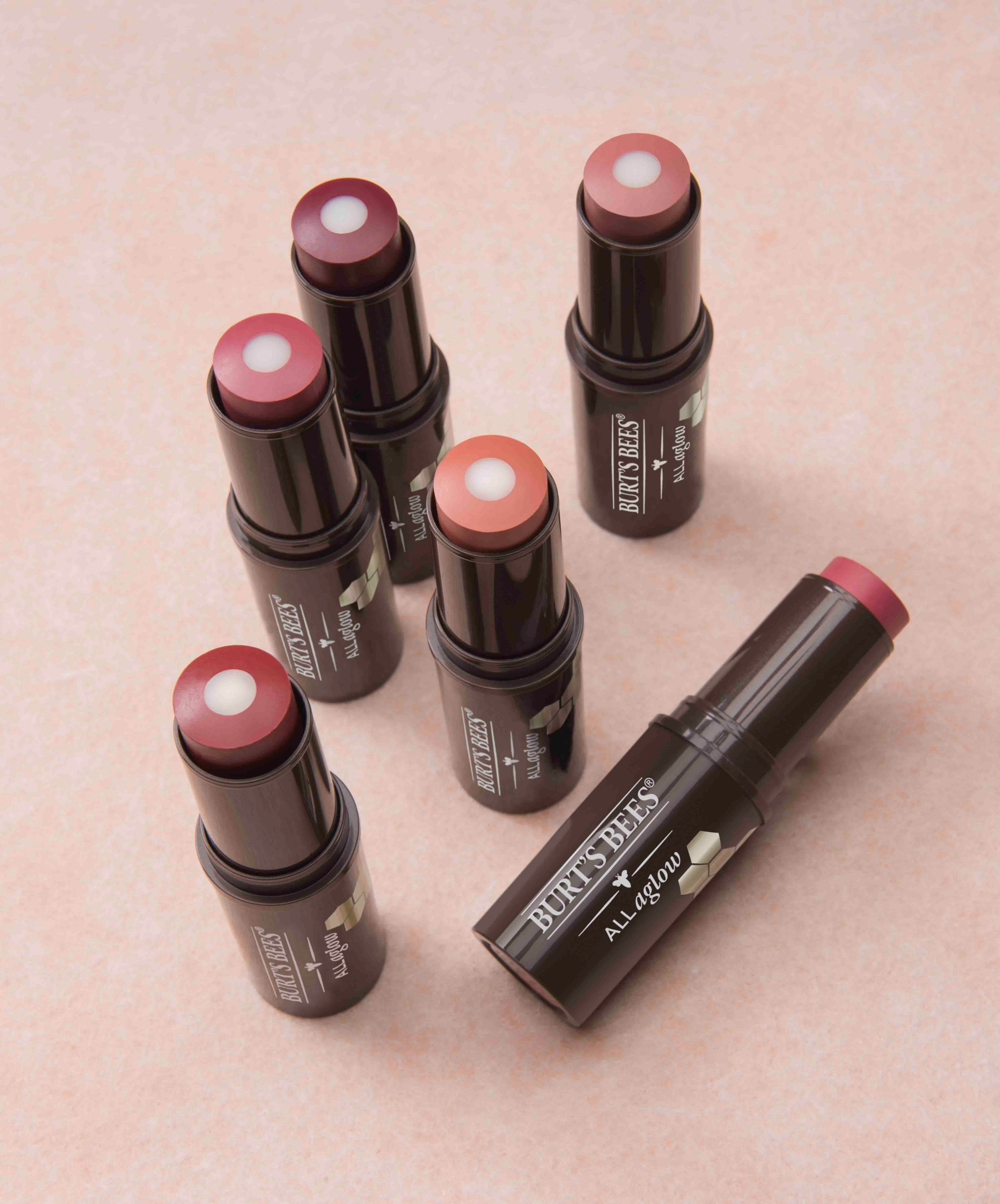
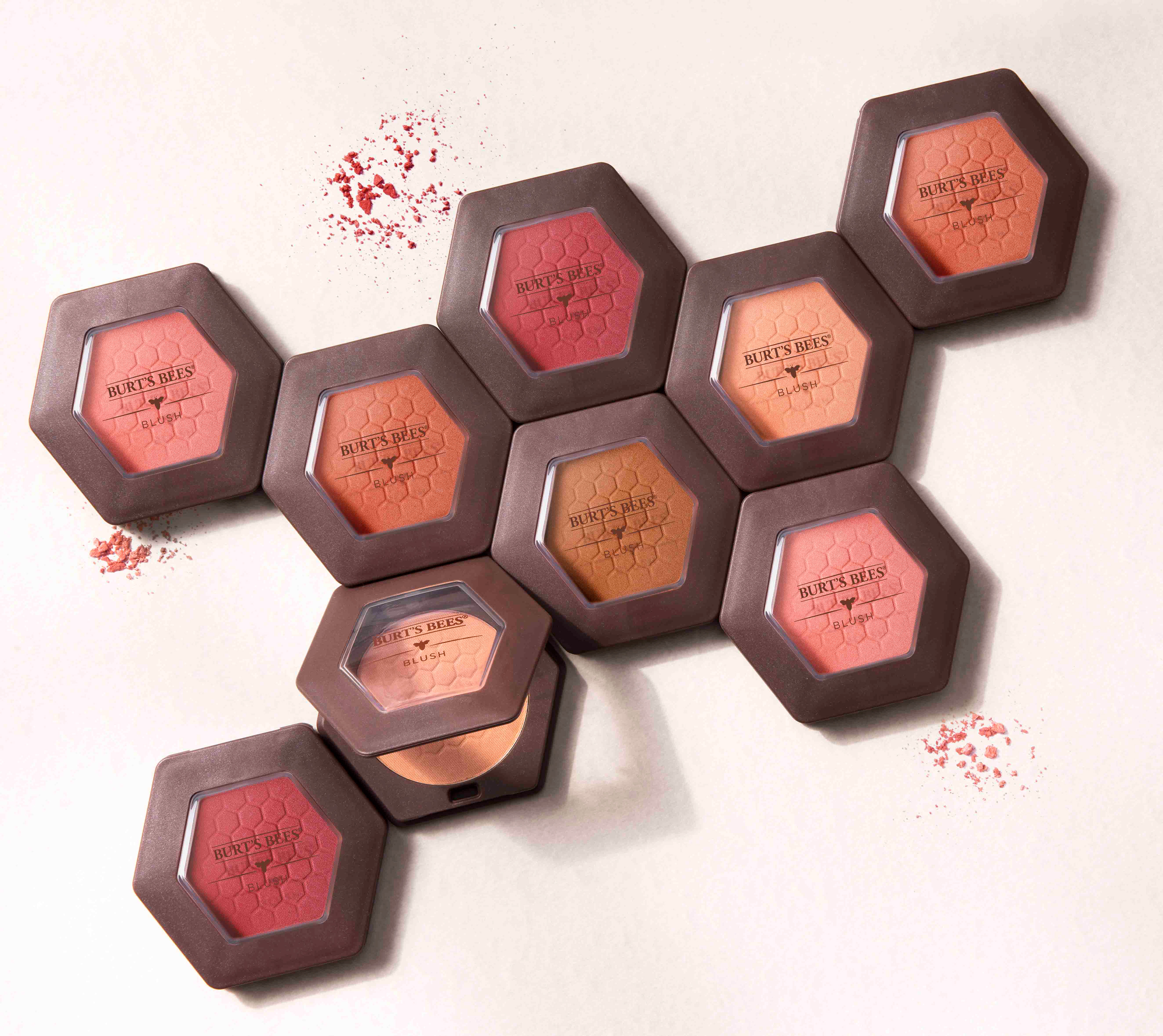
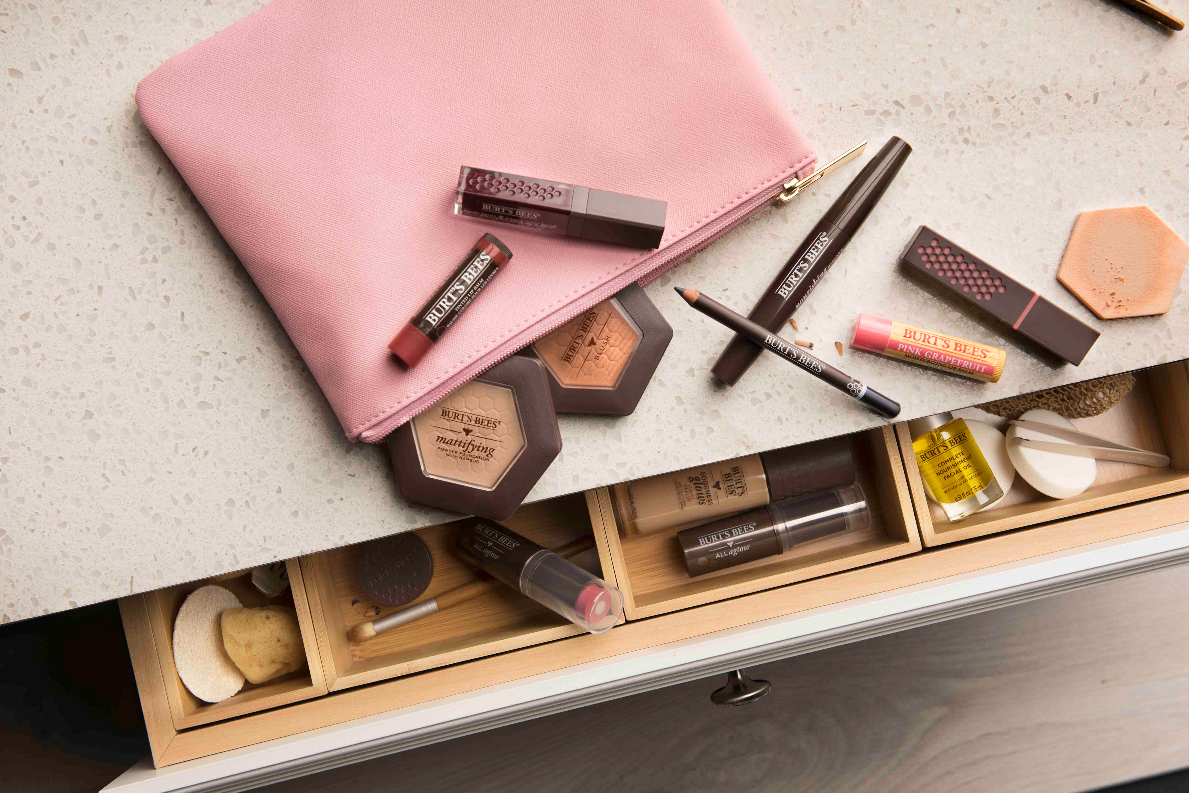
Burt’s Bees is no stranger to lip care and color, so it was a natural fit for the brand to launch an entire line of cosmetics products. The new line was positioned to be sold at drug stores as an affordable natural makeup. We wanted to convey that Burt's Bees is natural, but also an effective makeup line.
I spearheaded the design to ensure that it felt on brand, premium and differentiated at shelf. I wanted the brand bee to be the hero and a unifying element that brought cohesion to the whole line of products. The bee is locked up with thin lines to ground the architecture and visually break up the information. I brought in an elegant italic typeface to tie into the brand logo, and paired it with a modern sans serif to give the design an elevated look.
I spearheaded the design to ensure that it felt on brand, premium and differentiated at shelf. I wanted the brand bee to be the hero and a unifying element that brought cohesion to the whole line of products. The bee is locked up with thin lines to ground the architecture and visually break up the information. I brought in an elegant italic typeface to tie into the brand logo, and paired it with a modern sans serif to give the design an elevated look.